Clear space.
Maintain at least one full P-height of clear space around the logo. Don't crowd it. Don't shrink it. Don't recolor it outside the system.
24mm wide
88px wide
Aloe Dark · Mango 50 · Juicy Fruit · Dragon Fruit
Built on care. Delivered with personality.
Care, comfort, and respect — for every body.
Pynk Nymph is an inclusive waxing and skincare studio in Downtown Richmond. We exist to make grooming feel safe, easy, and welcoming — a space without judgment, where every body is treated with care.
Booking lives at pynknymph.com — manage your appointments yourself, anytime. Stay on cadence and your maintenance pricing rewards you for it.
◆ For every body · Downtown RVAThree rules that keep the brand honest. They show up in copy, color, type, and behavior — every time.
Pynk Nymph is for every body. Photography, language, and visuals reflect a wide range of identities — never an idealized fraction.
Confident, expressive, and a little mischievous — but the warmth and craft underneath always lead. Personality without volume for its own sake.
If a line is hard to read, it's wrong. We choose plain words, generous space, and high contrast — every time.
Direct, warm, a little funny. Never clinical, never apologetic. We use plain words, contractions, and the occasional well-placed "ass."
Three lockups. One voice. Built to flex.
The Pynk Nymph identity is a hand-drawn liquid letterform — friendly, mischievous, and unmistakable. Three primary lockups; a tiny family of accents.
Maintain at least one full P-height of clear space around the logo. Don't crowd it. Don't shrink it. Don't recolor it outside the system.
24mm wide
88px wide
Aloe Dark · Mango 50 · Juicy Fruit · Dragon Fruit
A loud palette earning quiet rules.
Two neutrals. Two greens. Two pinks. Two warms. Every brand moment lives somewhere on this grid.
Color should escalate with importance — not appear all at once. Start neutral. Add structure. Finish with emphasis.
Mon–Sat · Downtown RVA
New clients only
Book now◆ Now open
| Color | Use it for |
|---|---|
Mango 50cream |
Your default background. Start here almost every time. |
Aloe Darkdark green |
Body text, headlines, dark backgrounds. |
Aloe Lightlight green |
Accents, dividers, secondary panels. |
Juicy Fruitcoral red |
Buttons, CTAs, links. One per post. |
Dragon Fruitpink |
One big accent moment. Headlines, announcement backgrounds. |
Strawberrydeep red |
Sales, urgency, and promotions only. Use sparingly. |
A short, practical guide: which color combinations to reach for, and which to leave alone. If it takes effort to read, don't use it.
Expressive serif. Grounded sans. Structural mono. Three jobs.
Fraunces sets the tone. DM Mono carries the brand. DM Sans does the heavy lifting where it has to read.
Use for big text only — post headlines, taglines, hero moments. Never for paragraphs or small text.
Use for short structural text — pillar labels, post captions, callouts, slide numbers. This is what makes it feel like Pynk Nymph.
Use when readability matters most — long captions, emails, policy text, anything people actually read line by line.
Three styles max in any single layout. Build hierarchy with scale, not decoration.
If a line is hard to read, it's wrong. Lead with clarity — always.
Real bodies. Playful illustration. Mascot energy.
Real bodies, real texture, real comfort. Warm, human, approachable — never staged or clinical. Lighting feels natural or softly directional.
Illustration carries the playful, slightly mischievous energy. These motifs and the mascot are part of the Pynk Nymph visual language. Use them as accents — not as the main focus of a design. All assets are stored in the Pynk Nymph Canva Brand Kit and the Off Hours client asset library. Pull from there — do not recreate from scratch.

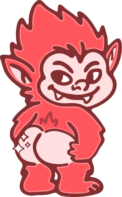
The brand personality made visible. Use as a spot illustration in social posts, merch, event materials, and promo content. Available as a standalone asset — do not alter the character's colors or proportions.
Post corners, section dividers, story backgrounds, spot illustration.
Energy accents, promo posts, bold emphasis moments.
Subtle accents, testimonial posts, soft editorial moments.
Brand mark accent, pillar labels, section openers, running footer.
The flat, expressive Pynk Nymph mascot is the visual heart of our personality. Use her where playfulness earns its place. Avoid using her where clarity has to lead.
The system, in one breath.
Pynk Nymph is built on comfort, confidence, and care — delivered with personality. Apply this system consistently and the brand stays recognizable, inclusive, and easy to trust.
◆ For every body